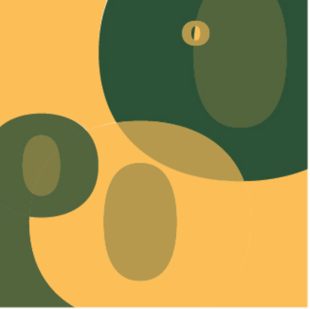
Card designDuring this project, my classmates and I were taught how adobe illustration works. For that reason, we had to design a playing card using a pen tool and other illustration tools. So I designed these semi abstract cards. |
||

|
Colour interactionThis class was called color and communication. It was about understanding colors and making our own colors by mixing Cyan, Magenta, Yellow and black (CMYK). I learned different theories of how colors act and react to different colors. This class was mostly working with acrylic print. In this exercise, I was learning how one color looks different when it is on a different hue. For example: a red color on a blue background looks a bit darker then a red color on a white background. |
||

|
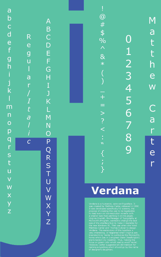
PostersThis was my favorite course. I learned about famous Graphic Designer, different typefaces and type rules. This poster is about a typeface called Verdana. I had to research the designer who designed this typeface and get to know more about this typeface. I also had to present how this typeface was different from other typefaces. The concept behind this poster was to show that this typeface is for computers. I used the vertical text because I wanted to show computer coding. |
||

|
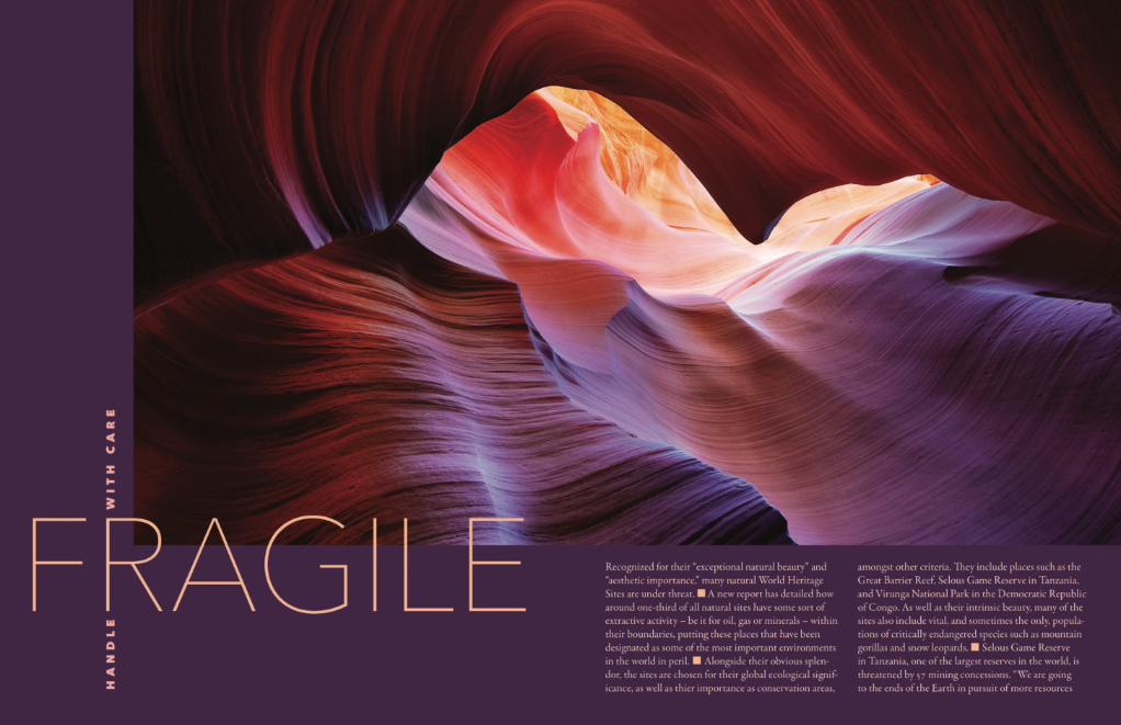
Booklet page designDuring this project, I learned how to make a poster alive with colours. I used the colours in the photography to create the whole page look smooth and elegant. |
||

|